
2026
Ruhsatsız
Branding
Art Direction

Ruhsatsız has been renewed.
We did not rebuild everything from scratch. Instead, we preserved the character of the existing logo and refined its proportions, applications and visibility, transforming it into a stronger and more consistent design system.
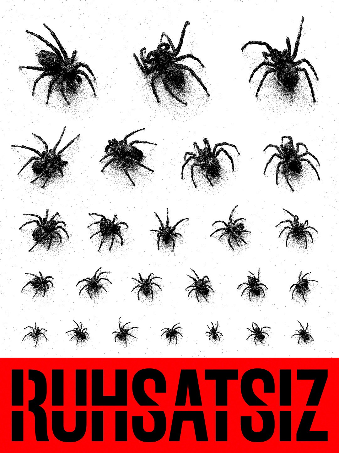
The new visual identity is built around a red, black and white colour palette. Stencil typography, high contrast, grainy textures and bold yet controlled compositions make Ruhsatsız’s independent character more visible.
The R monogram, derived from the logo, became both a favicon and a secondary brand mark. And then there is the spider. It felt like a natural companion to the idea of Ruhsatsız: a character that waits for no permission, creates its own space and quietly finds its way into unexpected places.
Rather than using it as a fixed mascot, we allowed it to move freely throughout the visual identity.
The result is a more coherent and lively visual world that can expand across editorial design, digital platforms, printed materials and textile applications.
New look. Same spirit.
No dinosaurs allowed.


More Works
(BB® — 02)
2026
Ruhsatsız
Branding
Art Direction
Ruhsatsız has been renewed.
We did not rebuild everything from scratch. Instead, we preserved the character of the existing logo and refined its proportions, applications and visibility, transforming it into a stronger and more consistent design system.
The new visual identity is built around a red, black and white colour palette. Stencil typography, high contrast, grainy textures and bold yet controlled compositions make Ruhsatsız’s independent character more visible.
The R monogram, derived from the logo, became both a favicon and a secondary brand mark. And then there is the spider. It felt like a natural companion to the idea of Ruhsatsız: a character that waits for no permission, creates its own space and quietly finds its way into unexpected places.
Rather than using it as a fixed mascot, we allowed it to move freely throughout the visual identity.
The result is a more coherent and lively visual world that can expand across editorial design, digital platforms, printed materials and textile applications.
New look. Same spirit.
No dinosaurs allowed.
More Works
(BB® — 02)
2026
Ruhsatsız
Branding
Art Direction
Ruhsatsız has been renewed.
We did not rebuild everything from scratch. Instead, we preserved the character of the existing logo and refined its proportions, applications and visibility, transforming it into a stronger and more consistent design system.
The new visual identity is built around a red, black and white colour palette. Stencil typography, high contrast, grainy textures and bold yet controlled compositions make Ruhsatsız’s independent character more visible.
The R monogram, derived from the logo, became both a favicon and a secondary brand mark. And then there is the spider. It felt like a natural companion to the idea of Ruhsatsız: a character that waits for no permission, creates its own space and quietly finds its way into unexpected places.
Rather than using it as a fixed mascot, we allowed it to move freely throughout the visual identity.
The result is a more coherent and lively visual world that can expand across editorial design, digital platforms, printed materials and textile applications.
New look. Same spirit.
No dinosaurs allowed.
More Works